
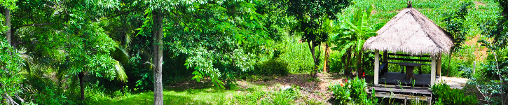
As described in a recent post, our robot now has an Infra-Red distance sensor, which allows us to measure the distance from the front of the robot to the nearest obstacle. With respect to the autonomous navigation code that we wish to write, this will be the cornerstone! In order to evalute the perfomance of the sensor, we surrounded the robot with obstacles and commanded it to rotate slowly in an anti-clockwise direction, while IR data was collected 20 times per second:

Surrounded by obstacles, C3Pi rotates anti-clockwise and returns IR distance data every 0.05 seconds
Collecting the Data
We initialized the workspace by loading first the “RainPro” graphics package (which is included with Dyalog APL on the Pi), and then the robot code:
    )load rainpro                   Loads the graphics workspace
    ]load /home/pi/DyaBot           Loads the robot control code
The following function loops 300 times (once every 0.05 seconds), repeatedly collecting the value of the robot’s IRange property (which contains the current distance measured by the IR sensor). The call to the UpdateIRange method of the bot ensures that a fresh sample has just been taken (otherwise, the robot will update the value automatically every 100ms).
      ∇ r←CollectIRangeData bot;i;rc
 [1]    r←⍬
 [2]    :For i :In ⍳300
 [3]        :If 0=1⊃rc←bot.UpdateIRange
 [4]            r←r,bot.Irange
 [5]            ⎕DL 0.05 ⍝ Wait 1/20 sec
 [6]        :Else
 [7]            ∘∘∘ ⍝ Intentional error if update fails
 [8]        :EndIf
 [9]    :EndFor
      ∇
We can now perform the experiment as follows:
iBot←⎕NEW DyaBot ⍬ ⍝ Instance of the robot class
iBot.Speed←40 0 ⍝ 40% power on right wheel only
⍴r←CollectIRangeData iBot ⍝ Check shape of collected values
300
iBot.Speed←0 ⍝ Let the robot rest its batteries
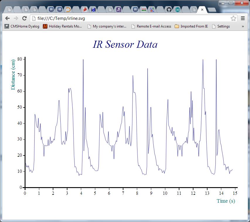
1⍕10↑r ⍝ First 10 observations to 1 decimal
15.3 12.8 13.7 12.7 13.7 11.4 9.9 11.1 10.4 9.4Now that we have the data, the following function calls will create our first chart:
     ch.Set 'head' 'IR Sensor Data' ⍝ Set Chart Header
     ch.Set 'ycap' 'Distance (cm)'  ⍝     Y caption
     ch.Set 'xcap' 'Time (s)'       ⍝     X caption
     ch.Set 'xfactor'(÷0.05)        ⍝ Scale the x-axis to whole seconds
     ch.Plot data                   ⍝ Create the chart
     '/home/pi/irline.svg' svg.PS ch.Close ⍝ Render it to SVG
Removing the Noise with a Moving Average
The chart above suggests that the robot performed a complete rotation every 5 seconds or so with just under 100 observations per cycle. The signal seems quite noisy, so some very simple smoothing would probably make it easier to understand. The following APL function calculates a moving average for this purpose – it does this by creating moving sums with a window size given by the left argument, and dividing these sums by the window size:
       movavg←{(⍺ +/ ⍵) ÷ ⍺}  ⍝ Define the function
       3 movavg 1 2 3 4 5     ⍝ Test it
 2 3 4
We can re-use the existing chart settings and plot smoothed data as follows:
      #.ch.Plot 7 movavg data
      '/home/pi/irline.svg' svg.PS ch.Close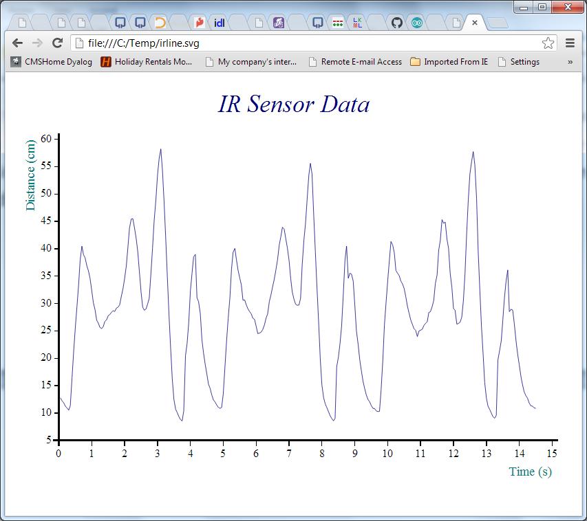
Making Sense of It
The pattern is now nice and clear – but how does the map compare to the territory? We can use a “Polar” chart of the distance to see how the measured distances compare to reality:
     ∇ filename PolarDistance data;⎕PATH;mat;deg;window;smoothed;angles;movavg
[1]   ⍝ Polar IR Distance plot - "data" is one cycle of observations
[2]   ⍝ Note the -ve right margin to get the chart off-centre!
[3]
[4]    ⎕PATH←'#.ch'      ⍝ Using RainPro ch namespace
[5]    window←7          ⍝ Smoothing window size
[6]    deg←⎕UCS 176      ⍝ Degree symbol
[7]    movavg←{(⍺+/⍵)÷⍺} ⍝ Moving average with window size ⍺
[8]
[9]    angles←360×(⍳⍴data)÷⍴data ⍝ All the way round
[10]   smoothed←window movavg data,(¯1+window)↑data
[11]   data←(⌈window÷2)⌽data     ⍝ Rotate data so centre of window is aligned with moving average
[12]
[13]   Set'head' 'Infra-Red;Distance;Measurement'
[14]   Set('hstyle' 'left')('mleft' 12)('mright' ¯60)
[15]   Set'footer' 'Distance measured;every 0.05 seconds;while 3Pi was rotating'
[16]   Set'style' 'lines,curves,xyplot,time,grid,hollow'
[17]   Set'lines' 'solid'
[18]   Set'nib' 'medium,broad'
[19]   Set('yr' 0 60)('ytick' 10)
[20]   Set('xr' 0 360)('xtick' 15)('xpic'('000',deg))
[21]   Set('key' 'Measured' '7 MovAvg')('ks' 'middle,left,vert')
[22]
[23]   Polar angles,data,⍪smoothed
[24]   filename svg.PS Close
     ∇
To align the chart with the picture, we need to:
- Extract the first 99 observations – corresponding to one rotation
- Reverse the order of the data, because the robot was rotating anti-clockwise
- Finally, rotate the data by 34 samples, to align the data with the photograph (the recording started with the robot in the position shown on the photograph)
We can do these three operations using the expression on the next line, and then pass this as an argument to the PolarDistance function, which creates another SVG file:
     onerotation←¯34⌽⌽99↑r
     '/home/pi/irpolar.svg' PolarDistance onerotation
If we compare the red line to the picture we started with, and take into account the fact that the robot was rotating quite fast and the IR sensor probably needs a little time to stabilise, it looks quite reasonable. The accuracy isn’t great, but with a little smoothing it does seem we should be able to stop little C3Pi from bumping into too many things!
Stay tuned for videos showing some autonomous driving, and the code to do it…
 Follow
This is very impressive, I want one too.
Just a though, can you set a wheel in reverse?
I’m thinking rotation in situ by setting:
iBot.Speed←20 ¯20
Indeed you can – the range of values is from ¯100 to 100.